The June spam update didn't change the winners: it changed the plumbing
No volatility spike, giants without a single loser. And yet, in one day, close to a third of the English Discover feed switched distribution channels, small sites absorbed the churn, and our quality score stratifies who falls. Measurements across 1,800 English-language sites, full lists of winners, losers and scores, with the French market as a control.
The video summarises the measurements. This article is the dated reference sheet for this update on the English-language market: it contains the full lists, the score tables, the method and the limits.
On 24-26 June 2026, Google rolled out a "spam update". On paper, a non-event: tracking tools didn't flinch, our volatility index stayed glued to its baseline, and the largest English-language sites didn't record a single loser. A ghost update, to be filed away and forgotten.
Then you look in the right place, and the non-event changes face. On the morning of 24 June, the share of the English article feed served by the pagination pipeline jumped from 23% to 31%: an eight-point step in a single day, on the first day of the rollout, on top of a ramp that had been climbing for weeks. Every other major pipeline receded at the same time. And while the plumbing changed, a sorting operation ran silently: among the giants, not one loser; among small sites, one in three lost visibility. That left one question: on what criterion was the sorting done? We built a composite authority and quality score to measure it, and the answer is nuanced in an instructive way: the score stratifies the risk, and where it fails, it fails for a reason that tells its own story about this update.
Here are the measurements, in the order that matters.
First, what we are talking about: spam update versus core update
Google doesn't run just one kind of update, and confusing them leads to bad diagnoses.
A core update, like May's (rolled out from 21 May to 2 June), is a deep recalculation. Many signals are reweighted at once, the overall appraisal of sites and content shifts, and the index itself can reorganise. Its signature is loud: broad, visible volatility, a reshuffle that touches every layer of the market, winners and losers everywhere, including among the big brands. On the English market, May's update produced exactly that: clear volatility spikes on 25-26 May and again on 11-12 June.
A spam update is a different calibre of event: a quality filter applied a priori. Google runs the site population back through its classifiers, and demotes or removes whatever sits below the threshold. Its signature is what we measure in June: no systemic volatility spike, because a targeted sort is not a reshuffle; damage concentrated in the lower layers of the market; and a gradient along measurable quality signals. To put it simply: a core update reshuffles the deck, a spam update sorts it.
The distinction is not academic. After a core update, the useful question is "how does Google now appraise my positioning". After a spam update, it becomes "which quality signals put me below the threshold". They are not the same projects, and the rest of this article shows why.
Definitions
Four notions come back throughout the measurements.
- Pipelines (surfaces): Discover is not a single algorithm but a set of distinct distribution channels: the editorial feed, feed pagination, related content, creator content, personalisation, trends... Every card in the feed is served by an identifiable channel.
- Volatility index: our daily composite indicator of how much Discover is churning. It aggregates several signals: the rotation of the sites present, changes in the visibility of sites and topics, the share of videos and other formats. A spike signals a broad redistribution; a floor value, a market rotating normally.
- Visibility: shares and variations measured on the captures of our independent observatory. Every figure quoted is a percentage, points or a ratio, never raw volumes: relative gaps are what carry signal.
- Measurement windows: unless stated otherwise, the pre-update period runs from 8 to 23 June and the post-update period from 27 June to 6 July, with the 24-26 June rollout excluded from every comparison.
Measurement 1: the pipeline switch, dated to the day
This is the central fact of this update, and no classic indicator could see it.
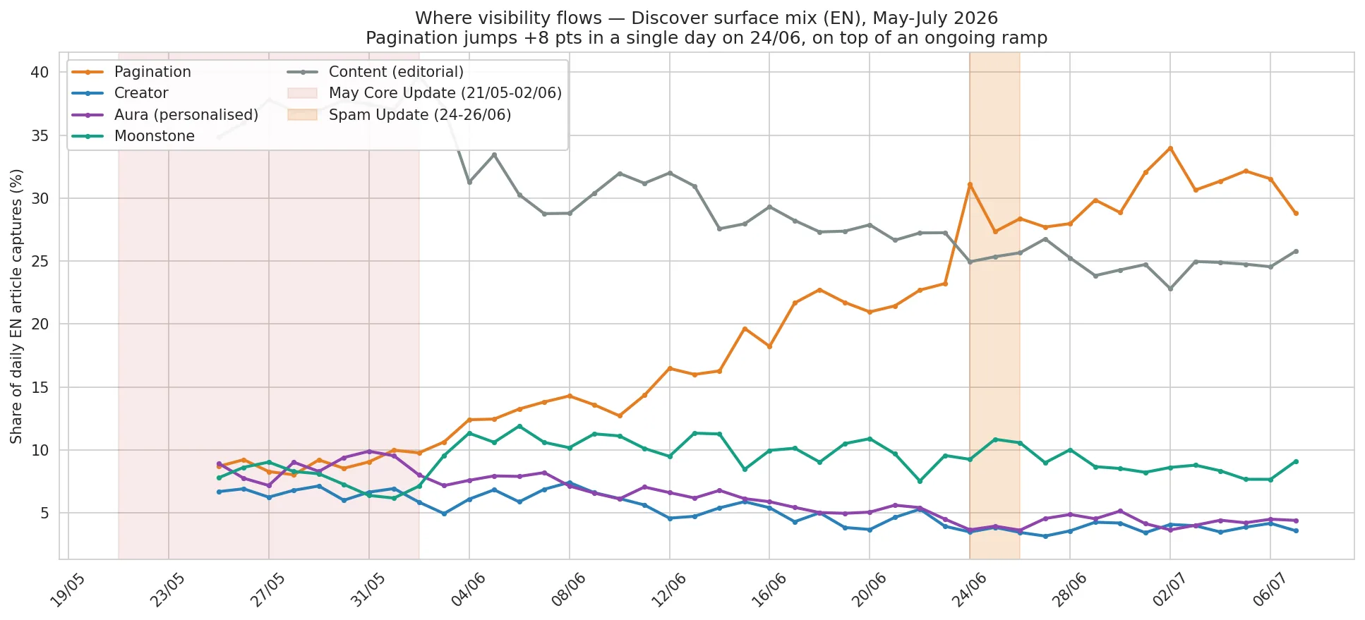
| Pipeline | Pre share | Post share |
|---|---|---|
| Pagination | 18.7% | 30.6% |
| Editorial (content) | 28.8% | 24.7% |
| Moonstone | 10.0% | 8.5% |
| Personalisation (aura) | 5.9% | 4.4% |
| Creators | 5.1% | 3.8% |
Pagination gains close to twelve points, and every other major pipeline recedes. On the daily curve this is no gentle slope: pagination weighed 23% of the feed on 23 June, 31% on the morning of 24 June, then settles on a plateau between 30 and 32% in early July. An eight-point step in a single day, co-dated with the announced rollout.
A displacement of this magnitude deserves two checks and one nuance before believing it. First, the total capture volume is stable over the period: this is a redistribution between channels, not a measurement artefact. Second, the creator and personalised surfaces are roughly halved as a share of the feed, while moonstone, hit harder on other markets, holds up better here (-1.5 points): the reallocation is real and differentiated, not a uniform drift. The nuance that matters: pagination was already climbing long before the update, from about 9% in late May to 23% on 23 June. The update did not create this transition, it brutally accelerated it, and only the 24 June step is strictly attributable to the update.
In other words: the update did not decide who wins, it decided which way visibility flows. Close to a third of the feed now transits through a pipeline almost nobody talks about. This is exactly the kind of displacement a Search Console will not show you, and it explains why two sites with comparable content can live through the same update in opposite ways: everything depends on their exposure to the pipelines that rise or fall.
Google does not wait for you between updates
This pre-existing ramp deserves a pause, because it carries a lesson of its own. Between the end of the core update rollout on 2 June and the start of the spam update on 24 June, the market was officially calm. During that lull, the share of pagination more than doubled: about 9% of the feed in late May, 23% on 23 June, climbing continuously and without the slightest announcement. Discover's serving evolves permanently; official updates are dated milestones and accelerations, not the only moments when the rules move.
For a publisher, the consequence is direct: monitoring limited to update windows misses part of the film. The transition that redefined the primary distribution channel of English Discover played out most of its course outside any announced update.
Zoom: pagination, up close
Since close to a third of the feed now flows through it, this pipeline needs to be understood. Pagination is the continuation channel. When an engaged reader scrolls deep into their feed, Google extends the thread: it re-serves other articles, often from the same publisher on the same subject, lower down the feed. Its physiognomy is distinctive: mid-feed to deep positions, strong recirculation of the same content, and almost exclusively articles; video and social platforms are structurally absent from it.
Which sites benefit? The answer does not mirror the composition of the market. Ranking sites by size and comparing, for each tier, the share it holds of pagination against the share it holds of the global feed, a clear bias appears, and it is even sharper on the English market than on the French one.
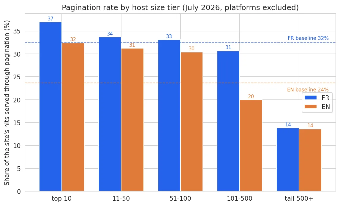
Established brands over-index: the top 100 English sites see 30 to 32% of their visibility flow through pagination, well above the market average, and the names carrying the channel are the authority press: The Guardian, the BBC, The New York Times, Reuters, Bloomberg, The Washington Post. At the other end, the long tail is all but excluded: beyond the top 500, that rate collapses to around 14%. Small publishers appear in the main feed, almost never in the scroll continuation.
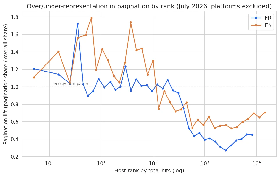
The over/under-representation curve by rank sums up the phenomenon, and reveals an English specificity: the "pagination club" stops around the top 100. Sites ranked 101-500 already fall well below parity (a rate of 20% against 30% for the top 100), where on the French market the drop only comes after the top 500. English pagination is markedly more elitist. Pagination is an amplifier of catalog authority, and on this market the authority bar is set higher.
Note: this reading is our hypothesis, based on our observations, not an official Google communication.
How do you obtain it? Not by targeting it directly: there is no "pagination recipe". It is earned upstream, by already being well served in the main feed on a subject, then by offering what the channel rewards: depth on a vertical and editorial continuity, the kind found in running news serials, followed narratives, dense coverage of a beat. And it must be taken for what it is: volume on a captive audience, not acquisition. The beneficiary is the already-engaged reader.
One mechanical consequence remains to be drawn, and it illuminates the whole update. If pagination structurally favours established brands with deep catalogs, then raising the share of pagination mechanically raises the share of established brands. No one needs to be penalised: by moving this channel from 19 to 31% of the feed, Google shifted an extra slice of its distribution into a pipe from which small and niche players are practically absent, and which on this market only really serves the top 100. The size sorting we measure in the next section is not only the product of a filter demoting the weak; it is partly built into the plumbing itself. And from Google's point of view, the choice is rational: serving more known, engaging brands raises the perceived quality of the feed without taking risks. A card from the BBC or Reuters will rarely produce a recommendation scandal; a card from an unknown site, perhaps. Pagination is Discover's safest channel, and Google just entrusted it with close to a third of the flow.
Measurement 2: sorting by size
While the plumbing changed, a sorting operation ran, with a clean signature.
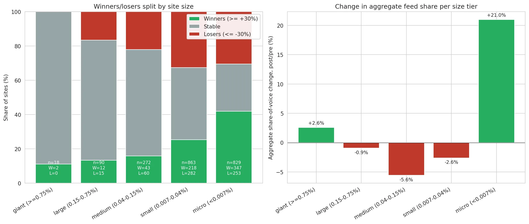
| Tier (share of EN feed) | Winners | Losers |
|---|---|---|
| Giants (≥ 0.75%) | 11% | 0% |
| Large (0.15-0.75%) | 13% | 17% |
| Medium (0.04-0.15%) | 16% | 22% |
| Small (0.007-0.04%) | 25% | 33% |
Among the giants, not a single loser: every one of the largest English sites crosses the update stable or rising. Among small sites, 33% of losers. The micro tier below (sites under 0.007% of the feed) is too noisy to read, a single article can swing its percentages. And no sector is singled out: sport recedes, but several seasons are ending; the losses inside science or tech coverage sit next to gains for other science and tech sites. Sites are being sorted, not subjects. Google did not drop the market: it readjusted its distribution against the sites its quality signals rank weakest, typically niche, independent or shallow sites.
The full lists
Here are the strongest gains, among sites representing at least 0.015% of the EN feed before the update, in share of voice (share of the feed, corrected for the evolution of the measurement fleet):
| Winner | Share of voice |
|---|---|
| en.defence-ua.com | +196% |
| autoweek.com | +189% |
| zmescience.com | +189% |
| prohockeyrumors.com | +164% |
| hoopsrumors.com | +163% |
| newscientist.com | +152% |
| bicycling.com | +146% |
| irishtimes.com | +132% |
| militarytimes.com | +126% |
| topgear.com | +124% |
| pbs.org | +119% |
| robbreport.com | +116% |
| hindustantimes.com | +107% |
| threads.com | +102% |
| dw.com | +102% |
| militarywatchmagazine.com | +100% |
| united24media.com | +100% |
| hendrickmotorsports.com | +98% |
Four profiles dominate this list. Defence and geopolitics first (defence-ua, militarytimes, militarywatchmagazine, united24media), popular science next (newscientist, zmescience), established general and international news (dw.com, irishtimes.com, hindustantimes.com, pbs.org), and specialist verticals with clear authority (autoweek, topgear, robbreport, bicycling, the sports-rumour desks). The sorting rewards recognisable expertise, not publishing volume.
Facing them, the steepest falls in the same scope:
| Loser | Share of voice |
|---|---|
| ncaa.com | -100% |
| ecoticias.com | -99% |
| worldsbk.com | -98% |
| thepwhl.com | -97% |
| tennistv.com | -96% |
| espncricinfo.com | -95% |
| joblo.com | -94% |
| news.xbox.com | -89% |
| directvelo.com | -87% |
| artfulparent.com | -85% |
| tennis365.com | -84% |
| digitimes.com | -82% |
| earth.com | -80% |
| kalshi.com | -80% |
| world-nuclear-news.org | -77% |
| openai.com | -75% |
The losers are more varied, and calendar effects must be separated out. Several are sports properties on a seasonal cycle: ncaa.com (US college off-season), thepwhl.com (women's hockey season closed), worldsbk.com (between rounds), and a cluster of tennis sites caught in the clay-to-grass transition; these moves are partly agenda, not algorithm. The genuinely algorithmic side is elsewhere: a science site like earth.com losing 80% of its share while newscientist and zmescience gain, or a tech-trade site like digitimes losing ground, points to a quality and authority re-sort inside a theme, not a theme-wide verdict.
Measurement 3: can we predict who falls? The score
On what criterion exactly does this sorting operate? Google evaluates by authority and quality, so the saying goes. Rather than assume it, we wanted to measure it. We built a composite score per site, out of 100, from four axes: authority (Knowledge Graph entity, social presence), audience (aggregated followers), seniority and depth of the Discover presence, and real-world quality, measured through the Core Web Vitals of actual users via CrUX and through the advertising density declared in ads.txt.
On the English market, the result is directionally clear but narrower than elsewhere: the loser rate falls as the score rises, from 36% in the middle of the scale to 15% at the top.
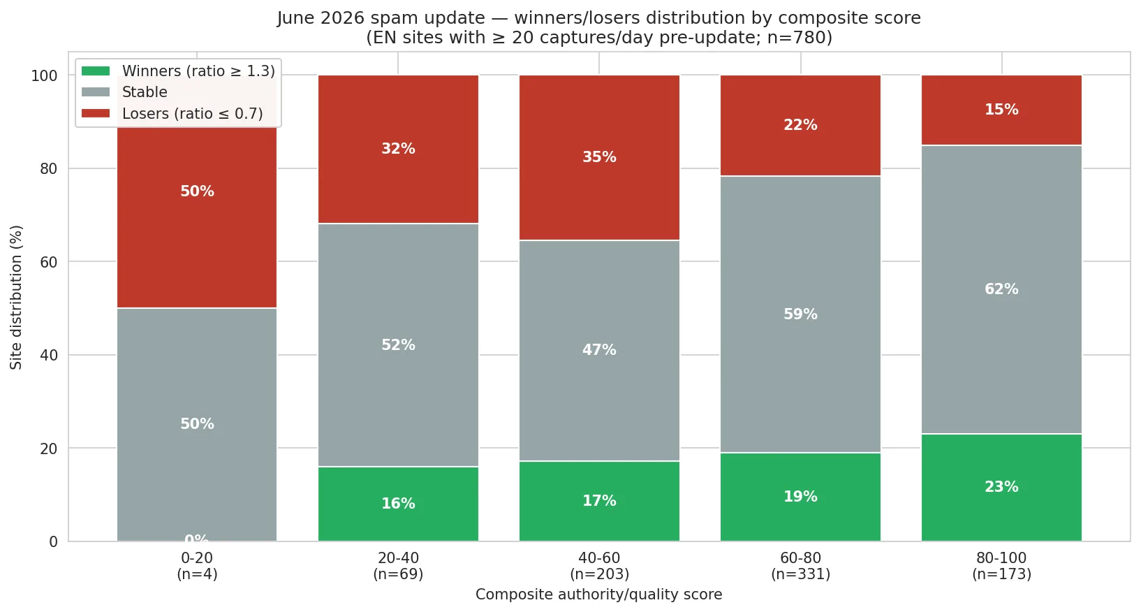
| Score bucket | Winners | Stable | Losers |
|---|---|---|---|
| 0-20 (low) | 0% | 50% | 50% |
| 20-40 | 16% | 52% | 32% |
| 40-60 | 17% | 47% | 36% |
| 60-80 | 19% | 59% | 22% |
| 80-100 (high) | 23% | 62% | 15% |
Two readings. First, the top of the basket is structurally protected: 173 sites score above 80, and they show only 15% of losers for 62% stable; established English publishers are the least exposed to reshuffling. Second, the gradient is real but compressed: the bottom bucket contains only four sites, because the English ecosystem is compact around the middle-to-upper range, with very little low-scored mass to sort. That is not a flaw of the score; it is a real characteristic of a more homogeneous, more mature market, and it is the structural reason this spam update bit less hard here than on the French side.
The top and the bottom of the basket, by name
Here are the fifteen best composite scores of the English-language market (among sites of at least 0.015% of the feed), and their June outcome:
| Site | Score /100 | June outcome |
|---|---|---|
| motogp.com | 96 | stable |
| vogue.com | 96 | stable |
| bbc.com | 94 | stable |
| theguardian.com | 93 | stable |
| wsj.com | 92 | stable |
| nhl.com | 92 | winner |
| businessinsider.com | 92 | stable |
| usatoday.com | 91 | stable |
| nytimes.com | 91 | stable |
| ign.com | 91 | loser |
| architecturaldigest.com | 91 | winner |
| sports.yahoo.com | 91 | stable |
| wired.com | 91 | stable |
| bbc.co.uk | 91 | winner |
| vaticannews.va | 90 | stable |
Eleven stable, three winners, one loser. The insurance function of authority holds, with one instructive exception (ign.com, caught in the gaming and consumer-tech re-sort visible in the losers list).
And the fifteen lowest scores of the same scope:
| Site | Score /100 | June outcome |
|---|---|---|
| philliesnation.com | 12 | loser |
| suffolknews.co.uk | 17 | stable |
| mickeyvisit.com | 19 | stable |
| world-nuclear-news.org | 20 | loser |
| thesupercarblog.com | 20 | stable |
| baseballsavant.mlb.com | 22 | stable |
| en.brujulabike.com | 22 | loser |
| slurrp.com | 22 | stable |
| footyheadlines.com | 23 | winner |
| bluesrockreview.com | 23 | loser |
| tennistv.com | 24 | loser |
| brewcrewball.com | 24 | stable |
| gardeningknowhow.com | 25 | stable |
| autonocion.com | 25 | winner |
| world-nuclear-news.org (www) | 25 | stable |
Five losers, eight stable, two winners: the bottom of the English basket is far less condemned than the French one, and that asymmetry is one of the cleanest market differences of this update. The survivors and winners down here are mostly niche specialists riding a live audience (footyheadlines and its football-kit community, autonocion) or subdomains backed by a strong parent (baseballsavant.mlb.com): profiles whose real strength the score does not fully capture.
The most instructive pair of the whole English analysis sits in the winners list. en.defence-ua.com (score 55) gains +196% with a clean profile: excellent real-user performance (LCP 896 ms, CLS 0.0), light advertising, a solid Discover history. The score is consistent with the outcome. militarywatchmagazine.com (score 36) gains +100% with a poor technical profile: an LCP above 4 seconds, a heavy ads.txt, a thin history. The score gets it wrong, and the reason is the point: both sites ride the defence and geopolitics surge. When a theme's tailwind is strong enough, the site-level quality score becomes secondary. The spam update is authority-weighted at the population level, but a booming theme can override a weak quality profile at the individual level.
Technical quality points the same way, with one market-specific twist
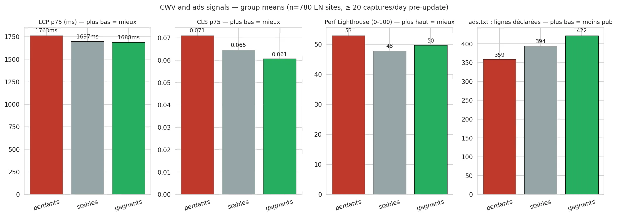
The three real-user Core Web Vitals all point in the expected direction, and on this market the strongest signal is responsiveness: the update's winners post an INP of 144 milliseconds against 187 for the losers, 23% better, while LCP (1,688 against 1,763 ms) and CLS follow the same slope more modestly.
The twist is the advertising signal: on the English market, the winners actually declare more ads.txt lines than the losers (422 against 359), the reverse of the French pattern. The likely explanation is that high-authority English publishers routinely declare hundreds of programmatic partners, so the line count picks up the scale of the media operation more than any "advertising lightness". It is a reminder that a proxy can change meaning from one market to another.
Two honest caveats to close this section. First: the score does not capture thematic surges, and June's defence and geopolitics wave pushed several weak-scored sites to strong gains. Second: none of this is a demonstration of causality. It is a correlation, measured for now on a single update.
Measurement 4: the switch-off that didn't happen
There is a second mechanism a spam update can use, more brutal than demotion: outright removal. Sites present before the update, absent after. We counted them, with a control run on a calm April period to establish the natural churn level, and the English result is a clean negative:
| Cohort (pre-update feed share) | Update exits | April control |
|---|---|---|
| ≥ 0.004% | 1.5% | 1.4% |
| ≥ 0.015% | 0.3% | 0.9% |
| ≥ 0.037% | 0.0% | 0.0% |
Sites leave Discover all the time; only the excess over natural churn is a signal, and here there is none: at every tier, the update's exit rate sits at or below the calm-period baseline. On the English market, this update demotes and reallocates; it does not unplug. Whatever damage it does, it does by turning sites down, not by switching them off. This is one of the sharpest contrasts with the French market, where the same update produced a removal wave at three to four times natural churn, concentrated on the lowest-scored sites.
Measurement 5: May against June, a two-sided reversion
One often hears that sites penalised by one update come back at the next. Did June undo May? To find out, we crossed, for each site, its May ratio with its June ratio. A blind screening, with no hand-picked examples:
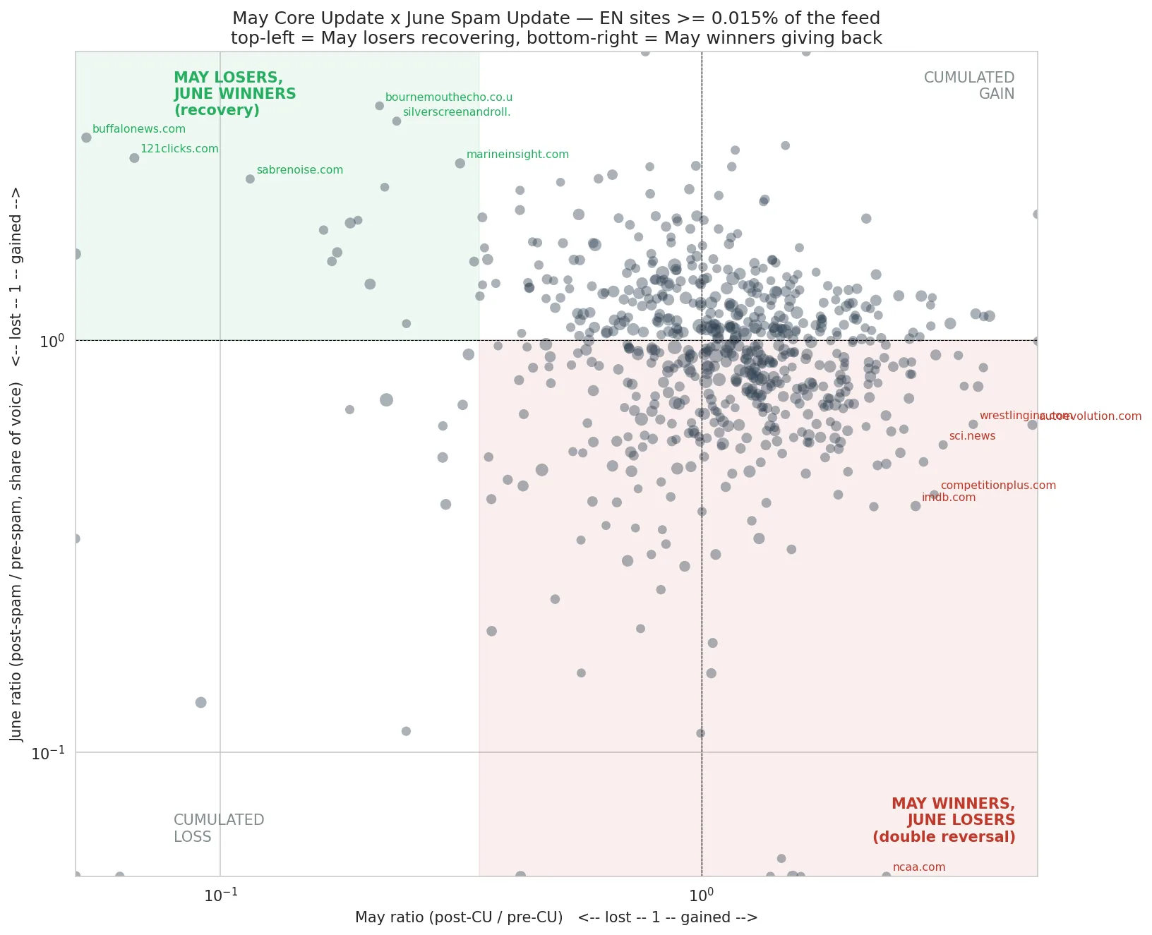
| May cohort | Sites | Median June ratio | Wins / loses in June |
|---|---|---|---|
| May losers | 64 | 1.23 | 47% / 30% |
| May stable | 504 | 0.95 | 21% / 24% |
| May winners | 77 | 0.91 | 6% / 22% |
May's losers tilt back up in June: a median of 1.23, and they win clearly more often than they lose (47% against 30%). That is a real recovery, though a partial one. May's winners give part of it back: a median of 0.91, and they lose almost four times more often than they win (22% against 6%). That is a clean double reversal. The stable centre, meanwhile, stays near the baseline.
The reading is neutral: a two-sided reversion to the mean. A site that loses has not necessarily lost forever. A site that wins can give it back at the next cycle: a post-update gain is a loan, not a salary, until the next cycle has confirmed it.
This result is consistent with the nature of the two updates described at the opening. May's core update reweighted signals, sometimes over-correcting in both directions; June's spam update, by re-running the quality filter, brings part of these over-corrections back towards their equilibrium level. The two mechanisms are different, and it is their sequence that produces the reversion.
Measurement 6: the theme that rises, and this time lifts its specialists
One last zoom, on the theme that detaches most clearly at feed level: international news, geopolitics and defence. Its share of the English article feed steps up from 8.5% before the update to 10.4% after, the single biggest thematic move of the window, while general sports and arts and entertainment are the mirror image (-0.5 and -0.7 points, partly calendar).
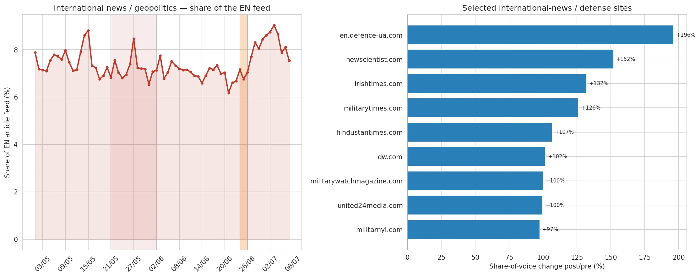
| Theme | Pre share | Post share |
|---|---|---|
| News, International | 8.5% | 10.4% |
| News, Local | 9.7% | 10.2% |
| Society, Social issues | 5.0% | 5.4% |
| Art and Entertainment | 4.0% | 3.3% |
| Sports (general) | 2.5% | 2.0% |
Two things are worth stating plainly. This sector detaches upward, which is unusual for a spam update whose story is normally about who loses. And the gain is broad within the sector, carried both by specialist defence publishers (defence-ua +196%, militarytimes +126%, militarywatchmagazine +100%) and by established international outlets (irishtimes +132%, dw.com +102%, hindustantimes +107%): a structural re-sort rather than a single news cycle, even if a live geopolitical cycle almost certainly amplifies it and the level should be re-measured once it cools.
This is also where the English market tells a different story from the French one. On the French side, the rising theme (the environment) lifted generalists while its specialist publishers fell. Here, the rising theme lifts its specialists too, including some with weak quality scores. The difference matters for the diagnosis: on this market, in this cycle, a strong thematic position could outweigh a mediocre quality profile. It is the exception that runs against the update's general rule, and knowing which side of it you are on is precisely the kind of question the score alone cannot answer.
And the French market?
The same update, measured on the French-language feed, offers a precious control: what repeats from one market to the other is structural, what diverges is a market characteristic.
Three findings repeat. The switch towards pagination, first: from 21.2% to 35.0% of the French article feed, with a step co-dated to 24 June on a pre-existing ramp, exactly the English pattern. The size signature, next: 6% of losers among the French giants against 53% among small sites; the damage concentrates at the bottom everywhere. The two-sided reversion, finally: May's winners give back, May's losers partially climb back, on both markets.
Four differences stand out in return. France had a genuine switch-off wave (hard exits at three to four times natural churn in the small tail, aimed at the lowest-scored sites), where the English market shows none. The French quality gradient is much steeper: 56% of losers at the bottom of the score against 11% at the top, versus 36% to 15% here; the French market carries a heavier low-quality tail to sort. The rising theme is not the same, and behaves differently: the environment in France, where specialist green media fell while generalists captured the subject; international news and defence here, where the specialists rose with the theme. Finally, French pagination is less elitist: its club extends to roughly the top 500, against the top 100 here.
What this changes for a publisher: four questions
1. Is your variation dated on the rollout, or are you assuming it? A drop that starts on 24 June and a drop that had been dragging since early June do not tell the same story; as we saw, most of June's pagination transition played out outside any announced update.
2. Is it one pipeline, or all of them? If all your channels move together, it is your site's status that has been recalculated, not the quality of one piece of content.
3. Your exposure: mostly the pipelines that rise, or those that fall? Close to a third of the feed now flows through pagination, a channel that on this market only really serves the top 100, and your exposure to it weighs more than your latest headlines. It is built through catalog depth and editorial continuity, not through one-off hits.
4. Your authority and quality score, where does it stand? A high score is the closest thing to insurance this update has shown, and responsiveness (INP) is the technical signal that separated winners from losers most clearly here. Real-world speed, an identifiable entity, depth: all of them levers you can act on before the next update.
If you cannot answer questions 2, 3 and 4, that is exactly the data your Search Console is missing. And it is exactly what we measure on 1492.vision, pipeline by pipeline, site by site: new indicators will soon appear in the interface.
Method and limits
The data comes from the Discover captures of the independent 1492 observatory, on the editorial article perimeter (excluding video, advertising and social platforms), for sites whose detected publication language is English, across all English-speaking regions. The comparison windows run from 8 to 23 June (pre-update) and from 27 June to 6 July (post-update), rollout excluded; the May cross-reference opposes 8-20 May to 3-15 June, clear of both rollouts; hard exits are controlled against a calm April window of the same geometry. The metric is share of voice, that is, the share of the feed on each window, insensitive to the evolution of the measurement fleet; a site is a winner if its ratio reaches 1.3, a loser below 0.7. The composite score is computed out of 100, from four axes (authority, audience, Discover depth, real-world quality), before knowing the outcome, on 780 sites with at least 20 captures per day pre-update.
The limits of these measurements deserve to be stated plainly. The rise of pagination had started before the update: only the 24 June step is strictly attributable to it. The score is correlational, measured on a single update, it does not capture thematic surges, and the ads.txt signal reads differently on this market than on the French one. A handful of sites carry an imperfect language label (a few French or Spanish domains appear in the English set); they are individually negligible, and the two affected rows have been removed from the lists above. The post windows stop in early July, and the next cycle can still revise these conclusions, in both directions. News cycles, the end of several sports seasons and a live geopolitical cycle first among them, explain part of the individual movements; they are flagged wherever doubt exists. Finally, our data are capture shares (impressions), not traffic volumes.
The golden rule, unchanged: never conclude "dead" or "saved" before seeing the next cycle. As for us, we keep measuring, pipeline by pipeline, site by site.
The video version of this analysis is on our channel: June 2026 spam update: the update that changed the plumbing.
Posted on 2026-07-20
More reliable, sourced reporting on Discover? Add us to your sources!
Add to sources Add to sources